Cropping Without Losing the Point
· 7 min read
The fastest way to ruin a good photo in a book is at its edges.
Not in the middle, where the subject is. At the margins, where a crop decides how much of the world stays in the frame. Get that decision wrong and a warm group photo comes back from the printer with a scalp shaved off at the top, a shoulder folded away at the side, or the whole thing squeezed until it forgets what it was of. Every one of those is a cropping mistake, not a fault in the photo.
Cropping has a bad reputation as the boring, mechanical step, the thing you do to make a photo fit a hole. But a crop is a real editorial decision. It’s the difference between a photo that breathes on the page and one that looks like it got caught in a door.
The print eats the edges
Start with a fact about printed books that a screen hides: the page is cut after it’s printed, and the blade has a tolerance.
A book is assembled on sheets larger than the finished page, then trimmed down to size, and that cut lands within a millimeter or two of where it’s meant to, not exactly on it. So any photo that runs all the way to the edge of the page, a full-bleed photo, has to be given a strip of extra image past the trim line, called bleed, so a slightly wandering cut never leaves a white sliver. The cost is that the outermost few millimeters of a full-bleed photo are sacrificial. They get trimmed, and you can’t say precisely where. That is the whole rule: anything you would hate to lose, whether a face, a hand, or the top of a head, has to sit well inside the edge, never against it.
None of this argues against full-bleed photos. A photo that runs off all four sides can be the most immersive page in the book, the reader dropped straight into the room. It only has to be a photo that can spare its edges: a wide landscape, an open scene, a face with room around it, and never a group crowded to the corners.
Read the safe zone first
Before a photo goes anywhere near a page, read where it can be cut and where it can’t.
Every photo has a safe zone, the region that carries the point. In a portrait it’s the face and a little air around it. In a group photo it’s the band of heads, from the tallest down to the shortest, plus the outermost people at each end. In a photo of a child running, it’s the child and the space they’re running into. Cropping is free everywhere else. Across the empty sky, the parking lot, the stranger’s elbow, cut all you like. It gets expensive the instant it reaches the safe zone.
A fast way to find that zone: notice what you would point to if you were showing the photo to someone across a table. That’s the part that can’t be cut. Everything your finger skips over is negotiable.
Most crop disasters come from ignoring this order. Someone picks a photo, drops it into a page shape, and lets the software fill the shape by trimming whatever hangs over. If what hangs over is sky, no harm done. If what hangs over is the tallest kid’s forehead, the book now has a beheading in it, and nobody chose that on purpose. The software just filled the hole.
Three ways to treat one photo
Take one group photo and three ways to place it.
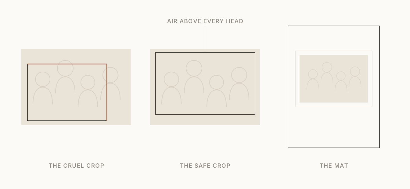
The first crop is the one software reaches for when it’s told to fill a wide, short space. It holds the middle and lets the top and the right side go, because that’s where the overflow happened to fall. It saves a little room, and pays for it with a head and a person.
The second crop keeps every head inside, with a deliberate band of air above the tallest. It’s a touch less tightly packed. It’s also the one nobody will ever wince at, because that margin is exactly what a wandering trim eats instead of a face.
The third isn’t a crop at all. It sets the whole photo, uncut, smaller on the page inside a border of paper. When a photo is precious and won’t survive any honest crop, this is the move, and it reads as care rather than compromise.
When the kind answer is a mat
There’s a reflex to make important photos bigger. For a photo whose subject runs to its own edges, bigger is exactly wrong.
A photo where the people already fill the frame corner to corner has no slack to give. Enlarge it to fill a page and something has to cross the trim, and there’s nowhere for the bleed to come from except the subject. The generous-looking choice, going big, is the one that cuts someone. The genuinely generous choice is to mat it: keep the whole frame, print it a little smaller, and let a margin of paper hold it. A matted photo says the whole thing mattered. A photo cropped into its own subject says a page shape won an argument with a memory.
A mat does a second quiet job, too. The band of paper around a busy photo gives the eye somewhere to rest, so a crowded frame reads calmer on the page than it ever did on the phone.
So the question at each placement isn’t only how big. It’s whether this photo has any room to be cropped at all, or whether the honest answer is to keep all of it and give up some size.
Vertical photos on horizontal pages
The hardest version of this is the standing photo on a lying-down page.
Most memorable photos of people are vertical. A person is taller than they are wide, and so is the frame that fits them. Book spreads, meanwhile, are mostly horizontal. Drop a vertical photo into a horizontal slot and the arithmetic is unkind: to make a tall photo fill a wide hole you crop the top and the bottom, and on a person that means the head, the feet, or both. A standing 2:3 photo forced into a 3:2 landscape slot loses more than half its height. There is no version of losing half the height that doesn’t take something you wanted.
So don’t force it. A vertical photo has three honest homes on a horizontal page: matted whole, with paper to either side; paired with a second vertical, the two of them sharing the width; or given a full page of its own, standing the way it was shot. Make the page bend to the photo. Force the photo to bend to the page and it’s the person who pays, with the head or the feet.
And don’t try to solve it by tilting the photo at a jaunty angle on the page. A tilt is a decoration; it gives no head back. The trouble is the shape of the hole, and the only real answers are the three above.
The crop travels with the slot
Cropping is hard to get right by hand because the same photo is safe in one slot and wounded in another.
A face with a comfortable margin on a full page has no margin left once that photo drops into a narrow half-column: same photo, same face, different amount of room, different crop. So the safe-zone check can’t be done once for the photo and filed away. It has to be redone every time the photo lands in a differently shaped space. This is why Enchanta reads faces and subjects first and checks the framing for each placement, not once per photo. The point isn’t to be technical about it. It’s to keep the page from quietly cutting something the photo was about.
A book that gets this right doesn’t look clever. It just never makes you flinch.
A good crop disappears
You notice a bad crop at once. The severed forehead, the amputated hand, the person clearly standing at the edge of a photo that no longer quite includes them.
A good crop, you don’t notice at all. You see the people and the moment. The edges did their work by staying out of the way, holding exactly enough of the world and no more.
So the real aim of cropping for a book is small, and it never changes from one slot to the next: keep the reason you raised the camera inside the frame. Everything the blade takes should be something you were glad to let go.
Questions people ask
- Why did my printed book cut off the tops of heads?
- Almost always the crop, not the printer. To fill a page shape the photo didn't match, something had to be trimmed, and heads near the top edge are the first to go. Placing the photo with a band of air above every head, or matting it whole, prevents it.
- Should I crop the photo or add a mat?
- Crop when there is empty room at the edges to lose without touching the subject. Mat when the subject already runs to the edge, since a mat keeps the whole photo and prints it smaller, which reads as care, while a forced crop reads as an accident. When in doubt, mat it.
- How much margin should I leave around faces?
- Enough that a trim wandering by a millimeter or two still can't reach a face. Leave a clear band above the tallest head and outside the widest shoulders, and keep anything you'd hate to lose well inside the edge rather than against it.
- How do I put a vertical photo on a horizontal page?
- Don't crop it to fit. A standing photo forced into a wide slot loses more than half its height, usually the head or the feet. Instead, mat the vertical whole, pair it with another vertical, or give it its own page. The page should bend to the photo, not the reverse.
- What are trim and bleed?
- Printed books are cut to their final size after printing, and the blade has a small tolerance. Bleed is the extra image that runs past the cut line so no white sliver shows if the cut wanders; the cost is that the outermost few millimeters get trimmed away unpredictably. Keep anything essential away from that edge.